Blue Shield of California Member Experience
Reimagining the digital experience for 4M+ members across responsive web, iOS, and Android
Key Outcomes
- Delivered a complete responsive redesign and native mobile apps within annual enrollment constraints
- Redesigned core member journeys (Login, Find a Doctor, Claims, Benefits, Dashboard) improving task completion and member satisfaction
- Created a phased benefits vision roadmap adopted by the client as their strategic direction
- Produced iOS and Android app prototypes, 450+ wireframes, user flows, and a comprehensive navigation strategy
CONTEXT
A Healthcare Giant Needing Digital Transformation
Blue Shield of California is a not-for-profit health insurer based in San Francisco serving over 4 million members. Despite massive scale, the organization was struggling to keep pace with healthcare disruptors and emerging digital innovations. Their digital experience was dated, fragmented, and failing to meet rising member expectations.

CHALLENGES
Redesigning Under Constraints
Blue Shield was nearing their annual enrollment period, which meant we couldn't risk disrupting the live experience. We conducted extensive research into the site's existing capabilities and launched a re-skinned responsive experience along with iOS and Android apps, all within the technical confines of Blue Shield's backend services.
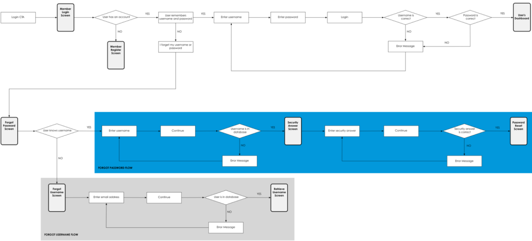
The project was structured in sprints, each focused on a core member experience: Login, Find a Doctor, Claims, Benefits, My Plan, ID Card, Dashboard, and Profile.
STRATEGY & APPROACH
Navigation Strategy & Information Architecture
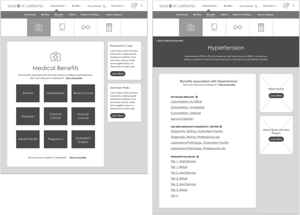
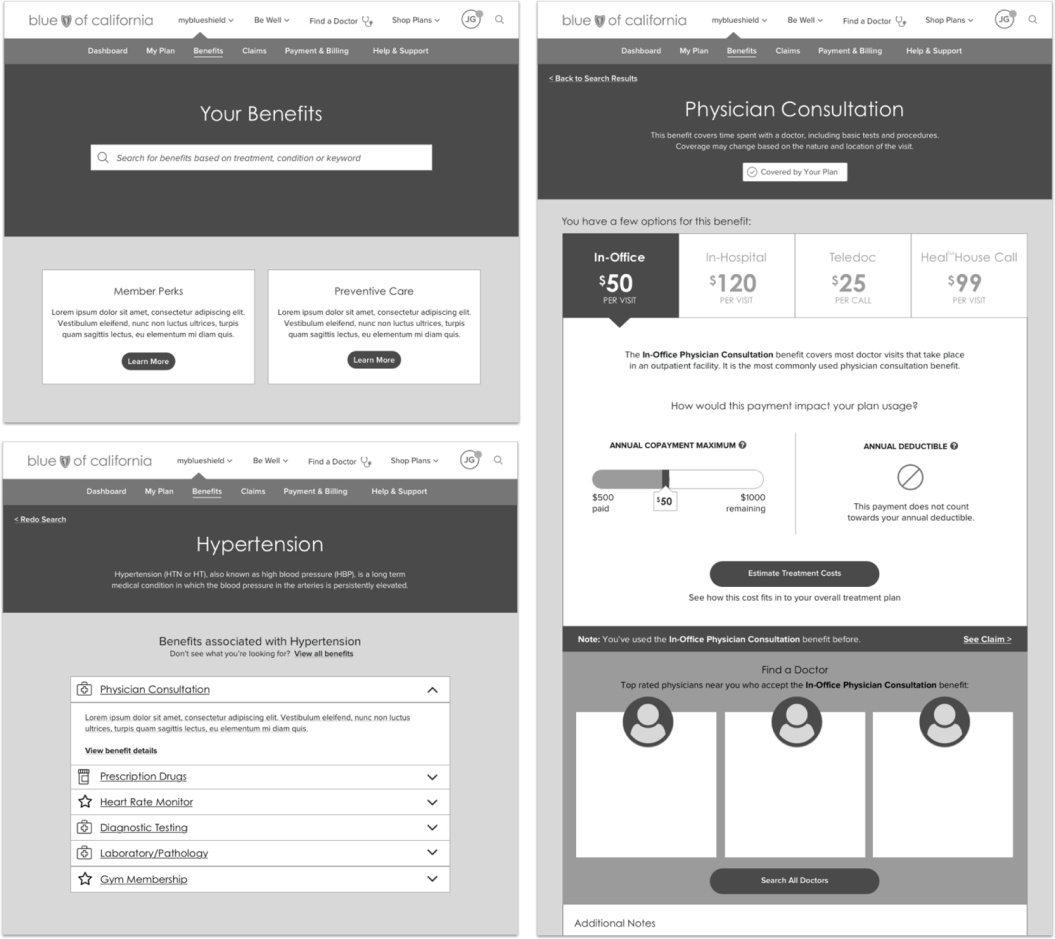
I led the development of the navigation system, page layouts, and overall digital strategy for both the responsive website and native mobile apps. Deliverables included extensive wireframes, annotations, user flows, and prototypes.
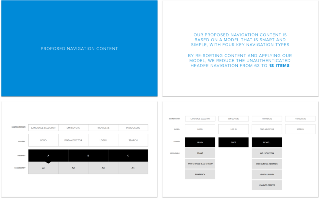
Excerpts from the Navigation Strategy
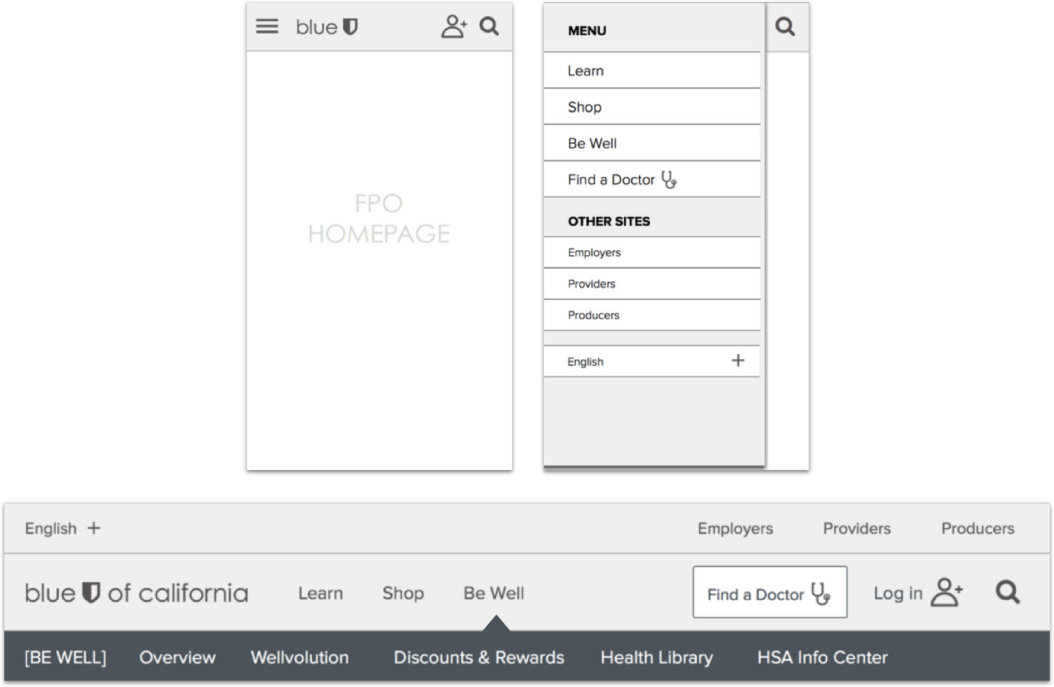
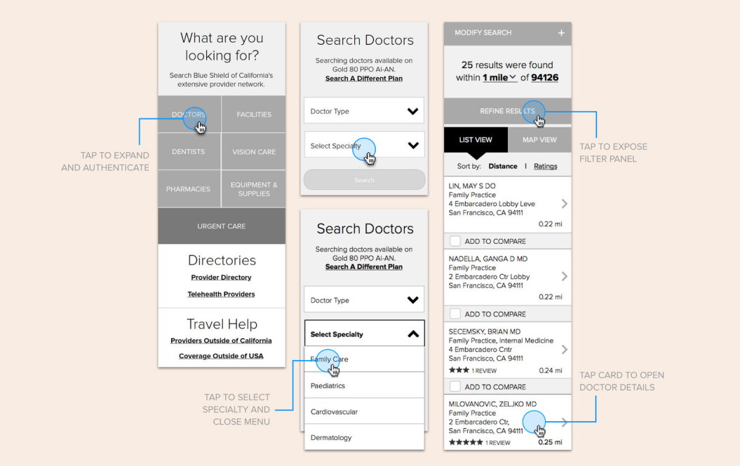
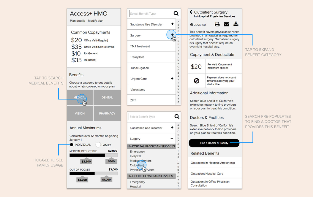
Wireframe and Annotation Samples

Impact
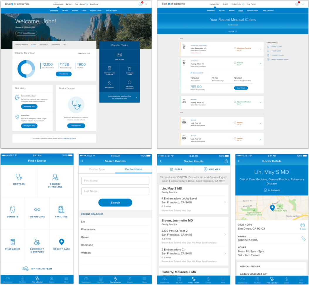
The redesigned experience helped members easily manage their plans, track claims, find benefits, and access urgent care—a significant leap forward from the fragmented legacy platform.
IMPACT & OUTCOMES
The Redesigned Member Experience
The redesigned Blue Shield experience was a significant leap forward. A reorganized navigation and intuitive design helped members easily manage their plans, track claims, find benefits, and access urgent care. The prospect experience incorporated Blue Shield's new brand positioning, more effectively guiding new customers to the right plan.
KEY DECISIONS & TRADEOFFS
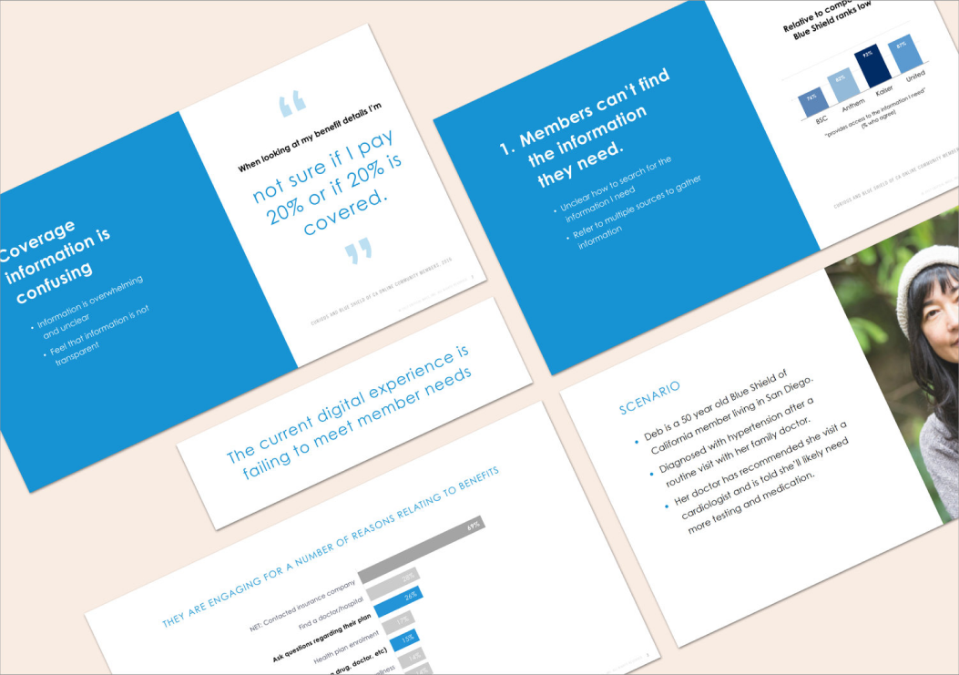
The Benefits Challenge
Benefits was one of the most visited sections, yet it remained confusing due to how backend data was structured. Even after the redesign, the experience needed a forward-looking vision. Blue Shield needed a strategic roadmap for how to transform their Benefits experience over time.
Benefits Vision Strategy
Working closely with a designer and strategist, I led research across members, competitors, and best-in-class digital experiences. We developed a phased roadmap with short, medium, and long term solutions, each grounded in a realistic member scenario that I storyboarded, sketched, and wireframed.
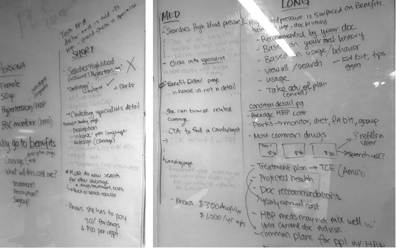
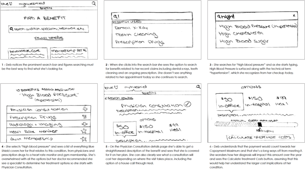
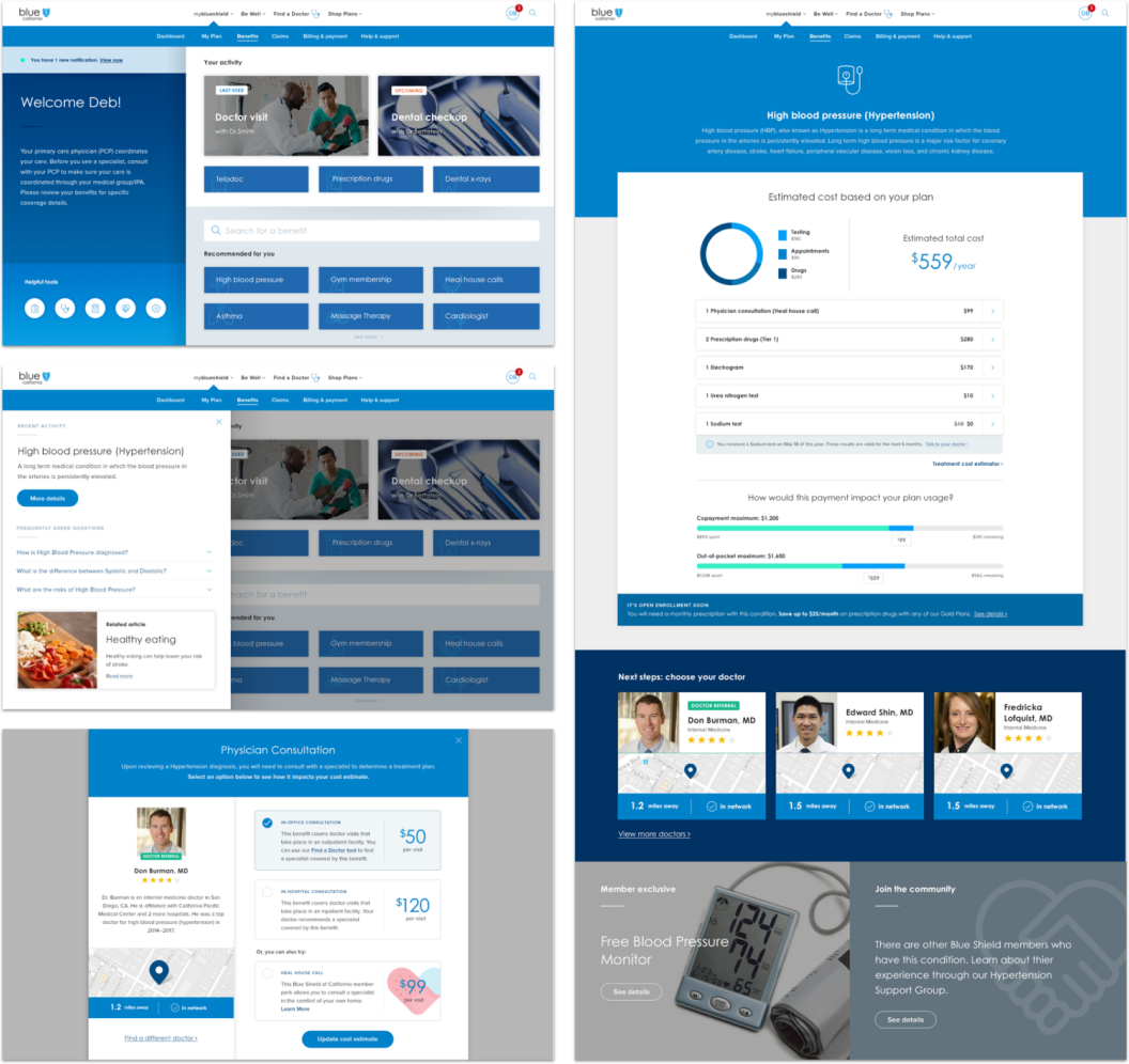
Short Term Vision
The immediate phase layered onto the existing experience, providing easy access to a curated list of benefits for the most frequently searched conditions and introducing more human-friendly language. A pragmatic first step toward a dramatically better experience.
Medium Term Vision
The next phase proposed robust search capabilities, simplified categorization, and contextual information connecting claims, doctors, and member perks into a more cohesive experience.
WHAT I'D DO NEXT
Long Term Vision
The long term vision represented the ideal: simple, human, and intelligent, designed around member needs rather than legacy backend structures. We paired the design with a strategic roadmap showing how incremental improvements could evolve the experience toward this ambitious destination.